
Related Articles → See More
-

Currency markets react to U.S.-Iran ceasefire uncertainty
-

Malaysian fertiliser supply hit by Russian and Chinese export curbs
-
South African farmers monitor rising fertiliser and fuel costs
-
Israeli fertiliser and packaging costs surge due to supply disruptions
-
New Zealand fertiliser supply secure for autumn period
-
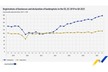
EU business registrations up 0.5%, bankruptcies rise 2.5% in Q4 2025
-

Agricultural land most expensive in Malta, the Netherlands, and Portugal
-
Second-life batteries for irrigation in Yucatán
-

For rent: Prismalaan West 3 in Bleiswijk - approx. 20,300 m² and part-letting from 4,500 m²
-
South African rand hits 3.5-year high